Follow this blog with bloglovin

Follow Typed up thoughts.

Friday, 24 June 2011

LogicDM, Gertrude & Piggy.

Now then, for those of you who are interested in IT & GRAPHICS you may want to draw your attention to a company called LogicDM. It is based in Cobham (that's in Surrey for all you not - so -geographical readers) and have now been going for twenty years.  

The company has recently developed the new digital side and concentrates in recruitment for the digital generation. Without wanting to name drop - they have worked with and recruited a lot of IT people for the likes of burberry... amongst many other lustful labels.

Have a look at their site at: http://www.logicdm.com/  ... and if that isn't enough to get your interested - then have a look at their mascots 'Gertrude & Piggy'. Officially the best mascots I have ever seen


REMEMBER TO SIGN UP FOR THE NEWS LETTER FOR ALL THE LATEST BLOG POSTS, NEWS & INFO <3

Thursday, 16 June 2011

The Kate Moss Effect

Follow my blog with Bloglovin

Whos heard the news? After ten years of modelling  for the makeup company, news has finally been revealed that Kate Moss has collaborated with Rimmel to bring out a new makeup range called 'The Kate Moss Effect'. 
In the collection there is said to be six shades of lipstick with a varied range of eyeshadows. 
The collection isnt released in stores until the end of the year (October 2011), but by that time I think it will have been the talk of the industry for such a long time that it will be bound to be a success. 

Makeup Trend: Colour Explosion

Viviene Westwood
Etro
Thakoon
Jean Paul Gaultier


As you can see... designers have been big on eye shadows this season. On the runways for 2011 we saw everything from dark and mysterious looking smoky eyes, to full lavender eyelids, and even eyeshadow contrasting on each side of the face - Viviene Westwood of course. 

You don't have to go this crazy to get the trend right. If your like me and have to work for a living (as cool as i think eyeshadow all over my face would be, I don't think my boss would find it amusing) then why not use a colour you like such as pink, purple, blue, green or whatever takes your fancy, and rather than whacking it on all over your lid, use the tiniest brush you can find and paint it on around your eye where you would usually put your eyeliner. It looks fashionable and thankfully will not result in giving your boss a heart attack.

Just remember to dip your tiny eyeshadow brush in a tiny bit of water first before mixing into the eyeshadow so it gets a little softer which means it will apply a whole lot easier! Bravo!

REMEMBER TO SIGN UP TO THE NEWS LETTER FOR THE LATEST BLOG POSTS, NEWS AND INFO ON TYPEDUPTHOUGHTS.

PRINTS PRINTS PRINTS


Now most of you will have seen Nicola Roberts' new video... if you havent then take a look

For me, the song is going to take some getting used too... I like it - but its a bit much when your in a chilled mood. I have yet to listen to it when I'm in a party - Esq vibe though, so I cant really say much on that topic. 
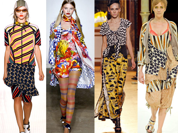
But as for her wardrobe in the video - I LOVE IT. Nicola Roberts has always been associated as being one of the more fashionable girls from the former girl band Girls Aloud, but in this video her styling has been taken to a whole other level. And Why? Well for me personally, I am totally in awe of how well she has made use of various patterns. She's managed to throw almost every pattern on trend right now together... and has still managed to look utterly fabulous. 

Nicola Roberts has woken me up to the world of extensively mixing up patterns... and having researched into this collaborative trend, let me tell you its going to be big this Winter!

For those of you who are a bit scared by this news, I have put together a little how too guide. 

Here is the only major rule to look out for:


You can literally put anything together... you've just got to know how.

Be it stripes, leopard print, polka dots, tribal, floral - you can literally put anything and everything together... you just have to make it look like you mean business - not like you had a fight with your wardrobe, and your wardrobe won.  capiche?! And the secret?... basically vary the size of your prints... and try not to go too crazy with colour until you've mastered the mix match technique. (basically stick to colour you know match - associate by theme - nautical, pastels etc.) 

For example. If I wanted to team together stripes, leopard print & floral patterns then I would make sure that say the size of the stripes were big, whilst maybe the floral pattern was kept ditsy and then I would use leopard print in an accessory to brake the stripes and the floral up a bit. 

However, there is an exception to this rule... if you keep the colours the same sort of tones (this means no clashing, contrasting or major colour blocking) then you can get away with similar sized patterns - Have a look: 
It does take a bit of practising, but once you've gotten used to knowing what patterns work well together, you will be prancing around like Nicola Roberts in no time! 

Keep your eyes open for more tips 'n tricks on how to master this trend, coming soon to Typedupthoughts. 

REMEMBER TO SIGN UP TO THE NEWS LETTER FOR ALL THE LATEST BLOG POSTS, NEWS AND INFO ON TYPEDUPTHOUGHTS.

Tuesday, 14 June 2011

Tie Dye rocks


LEFT: Beta Fashion 'Pica' Print Tunic By Nikki Strange £80
CENTRE: Beta Fashion 'Woodstock 2' Maxi Dress by Harriet Holling £150 
RIGHT: Beta Fashion 'Woodstock 2' Print Kimono by Harriet Holling £80

Remember tie Dye?! ... okay, stupid question - because who could forget it!? Well this cringe worthy trend is soon set to take its turn on the fashion front of 2011 later on this summer.  Yes. Basically tie dye is back.  
Some of you may be thinking: "I don't want to look like a wardrobe explosion from the eighties so I think I'll pass." ...and that's fair enough, but be warned you will be missing out as this summer tie dye is back seemingly having learned from its mistakes of collaborating with polyester t shirts. 
This summer tie dye has finally been introduced to chiffon i.e. long floaty fabrics ... which lets face it is a great look for summer festivals (teamed with wellies and a parka) or even for a night out (thrown on with patent heels or punked up with a studded bag). 
The above examples from asos are a bit expensive ... but if you want something cheaper - Topshop have also taken a liking to tie dye. Check out these leggings:
RED tie dye leggings £22
BLUE tie dye leggings £22
MULTI COLOURED tie dye leggings £20

  These will look great with a range of on trend looks - 
For festivals wear them with a long vest top, denim waistcoat jacket  or a parka a pair of long white socks and some brightly coloured wellies. 
If your off out shopping keep it simple with a white over sized top, denim jacket and a pair of boots or sandals. Or if you want to be really daring then swap the denim jacket for a coloured denim jacket / cardigan / top... think pink denim jacket for blue leggings, yellow cardigan for red leggings
Summer is all about having fun - so is the tie dye trend... so make the most of it while you can.
REMEMBER TO SIGN UP TO THE TYPED UP THOUGHTS NEWSLETTER ON THE TOP OF THE SIDE BAR FOR ALL THE LATEST POSTS. 
 

Saturday, 4 June 2011

PASTEL RAINBOW - pick one colour only & vary the shades.

The colour PINK has received numerous rounds of applause as it re appeared on the runways for s/s 2011. keep it simple and don't mix it with too may colours if your going for the ombre pastel look. The whole point is to stick to one colour - but different shades
 Forget about pale blue. Its all about pale turquoise. As you are mixing shades of a certain colour together - it is okay to put a bit of blue in there... as long as the bulk is kept on trend = turquoise. Paler shades of this colour are surprisingly flattering on pale complexions. If you want to make the look a little more interesting then add in a bit of black or white, or maybe just make use of texture? Go for it.
Coral is another word for orange. Peach is forbidden when it comes to the coral colour palette... okay? You'll just look like your wearing your grandma's prom dress, so lets not even go there. Coral tones are however in the same 'family' as pink and orange. Keep the shades muted though - or else you be partying with the clashing crew at the block colour party - not relaxing at the pastel rainbow.


Whilst every one has always liked the colour yellow - I'm guessing no one has really ever given it any space in their wardrobes. Okay - lets just set one thing straight - unless you choose to wear the brightest shade imaginable, wearing yellow will not make you look like a bumble bee. It will however warm up paler skin tones, and flatter darker skin tones - so really everyone wins! Great!

REMEMBER TO SIGN UP TO THE NEWS LETTER FOR ALL THE LATEST POSTS.  

Christopher Kane

I was flicking through prior runway shows for S / S 2011 when I found these two absolute sherbet neon designs by Christopher Kane - seen last autumn for this current season!

COMING SOON : I'm working on neon outfit posts that will make us all look amazing for late June / July.

REMEMBER TO SIGN UP TO THE TYPED UP THOUGHTS NEWS LETTER FOR ALL THE LATEST BLOG POSTS & INFO.